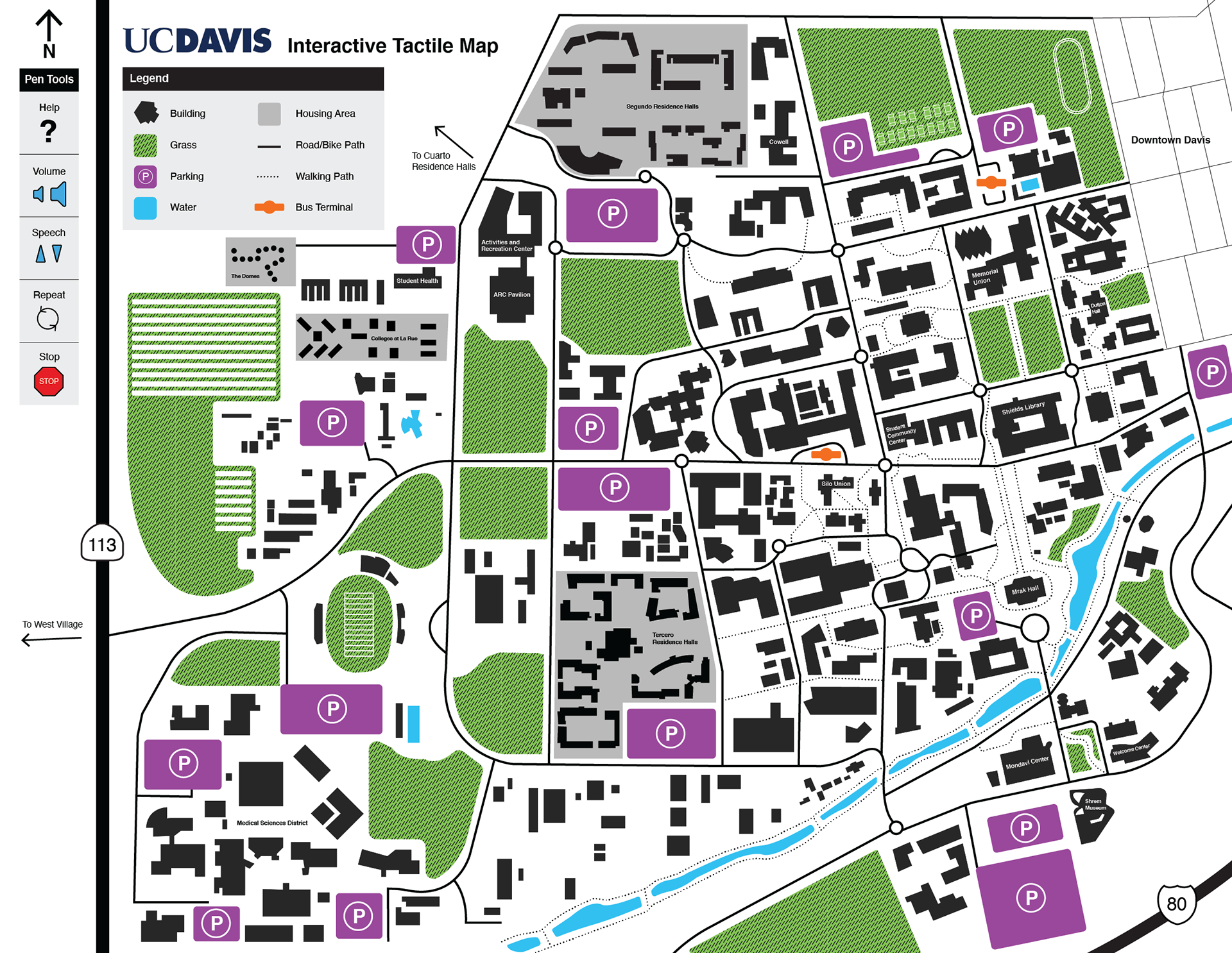
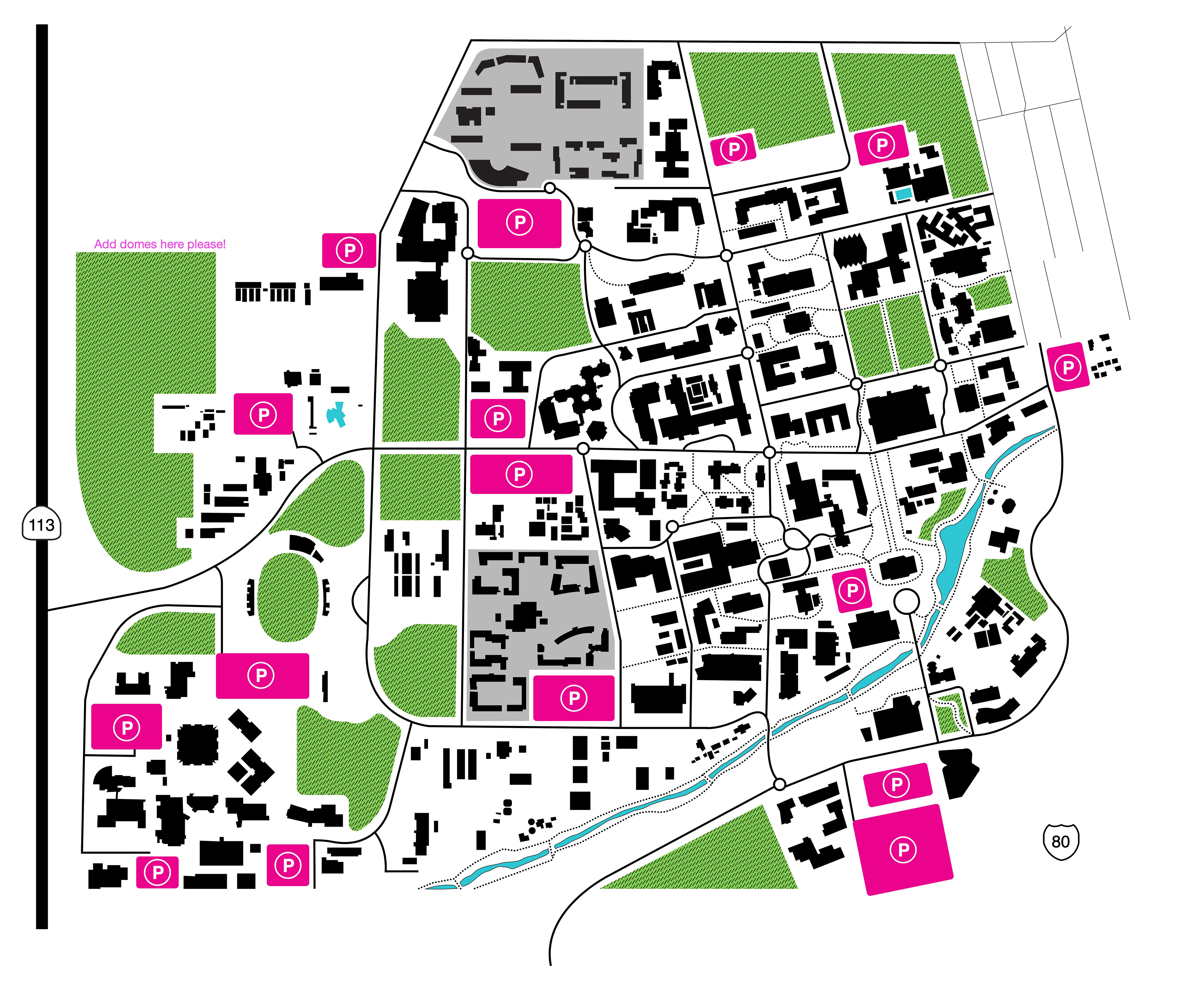
UC Davis is a very complex campus including bodies of water, bicycle circles, parking lots, buildings, and grass fields. We were challenged with creating both a visual and tactile language to convey this information.
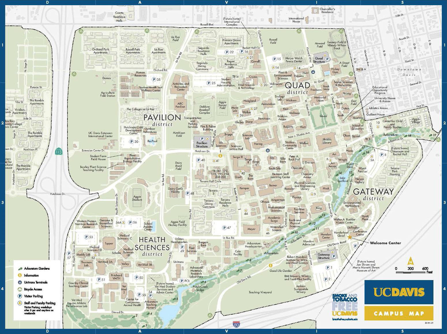
The current UC Davis campus map handed out to visitors at the Welcome Center.
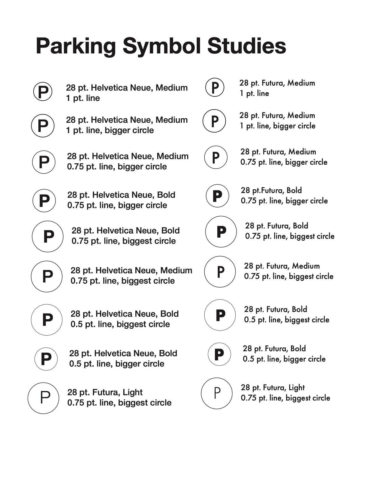

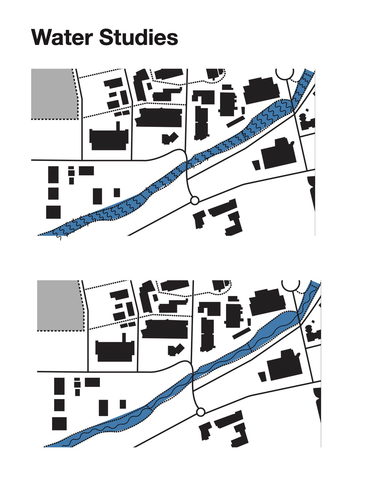
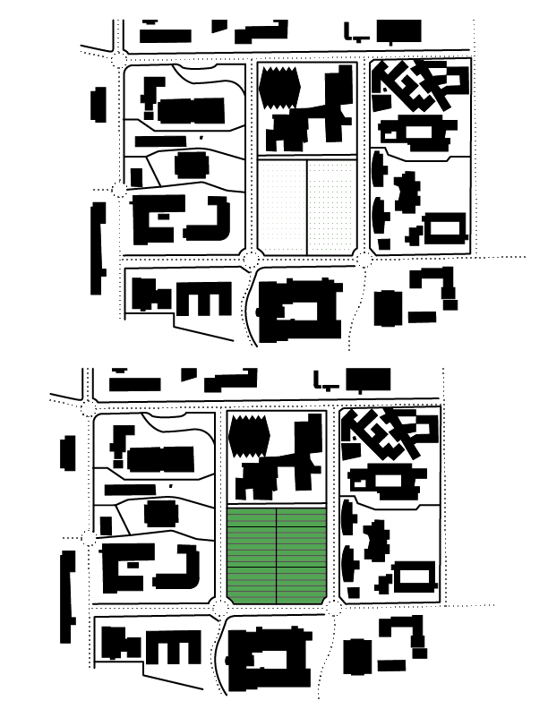


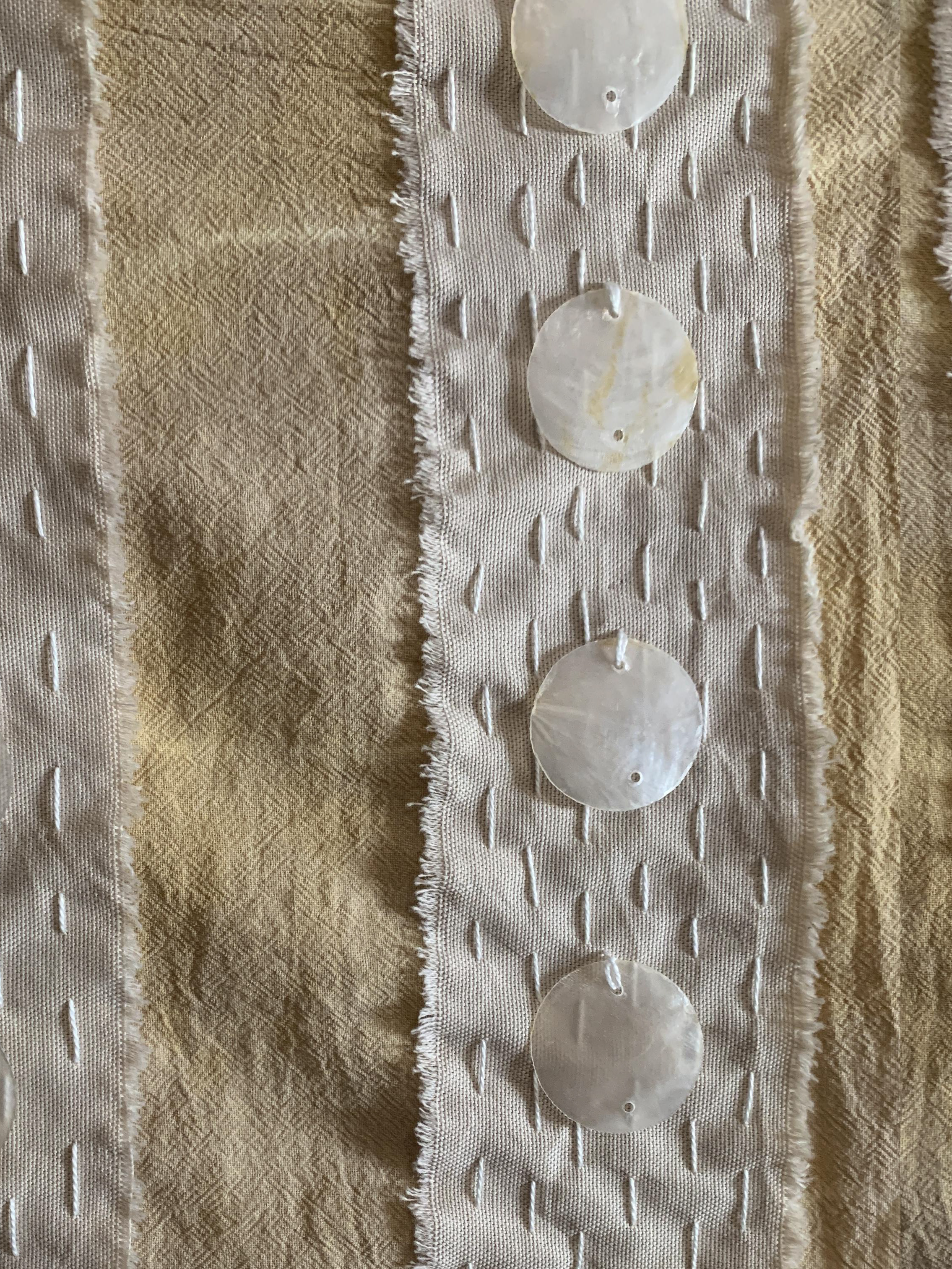
Iterations I designed to find the most legible fonts and textures to use for symbols and geographical features.
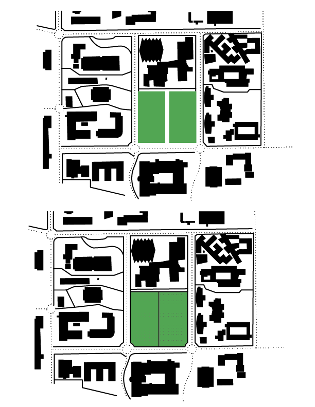
Parking symbols, water, and grass fields.
Parking symbols, water, and grass fields.
Color studies to create the most legible high-contrast colorways for a colorblind user. Feedback was received from visually impaired and colorblind UC Davis students.

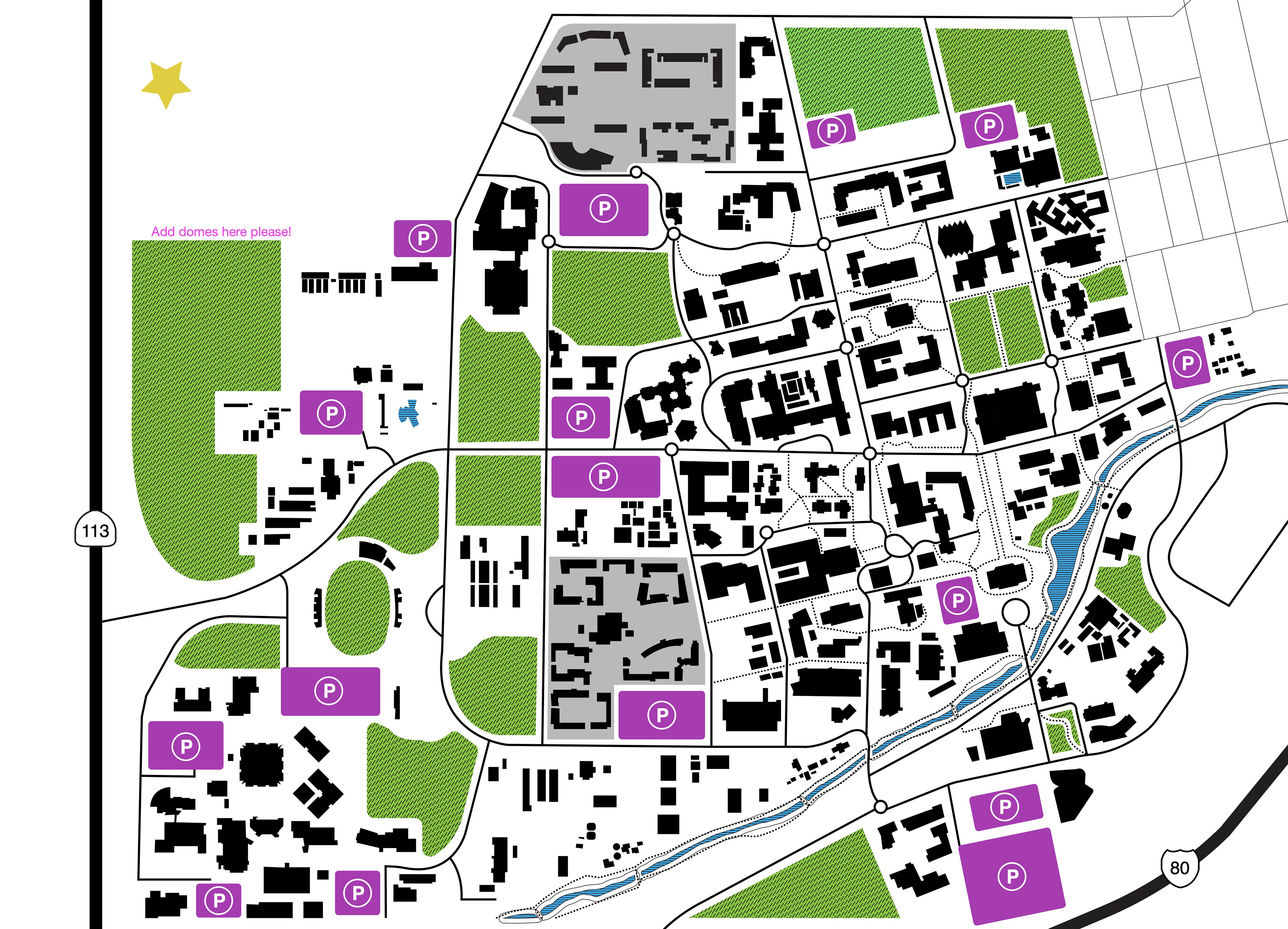
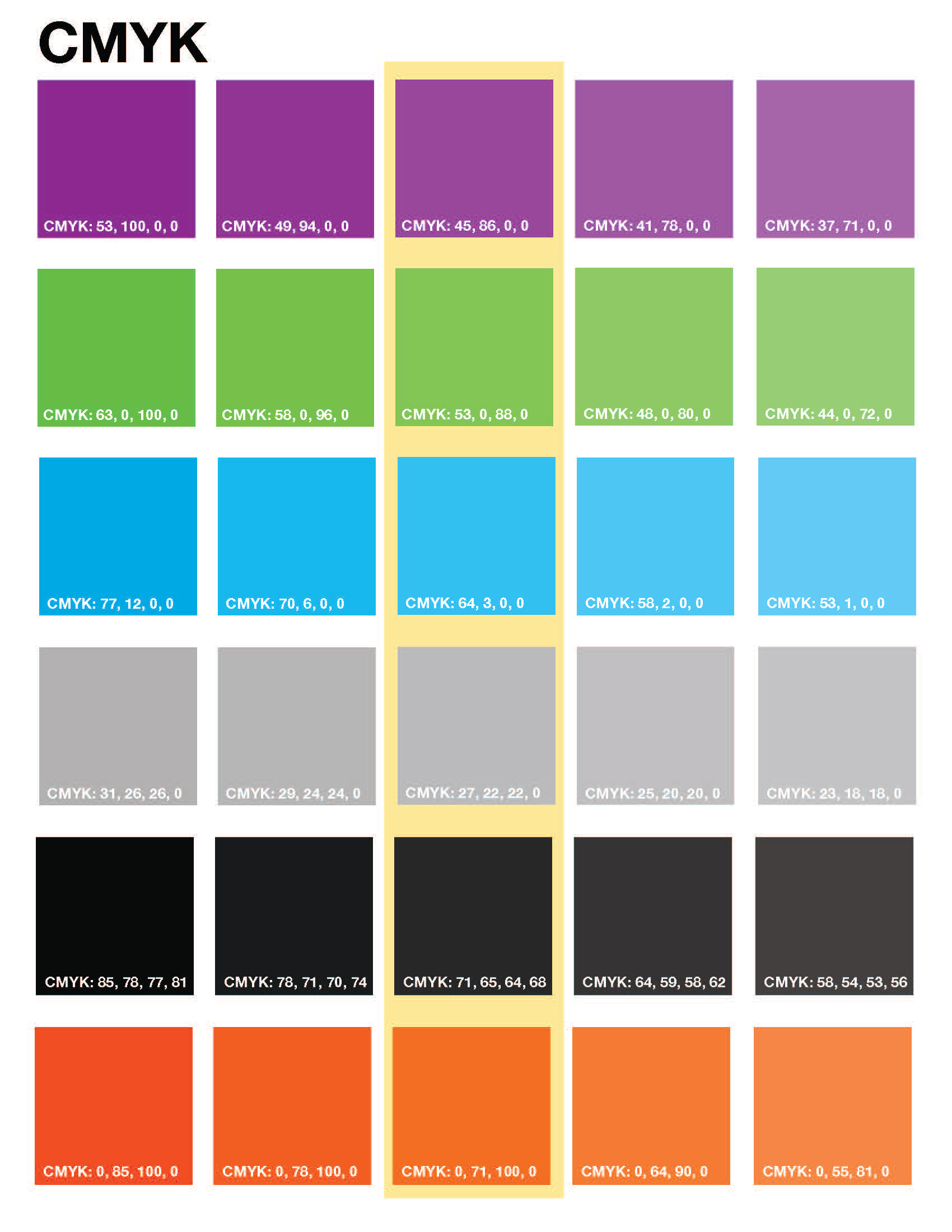
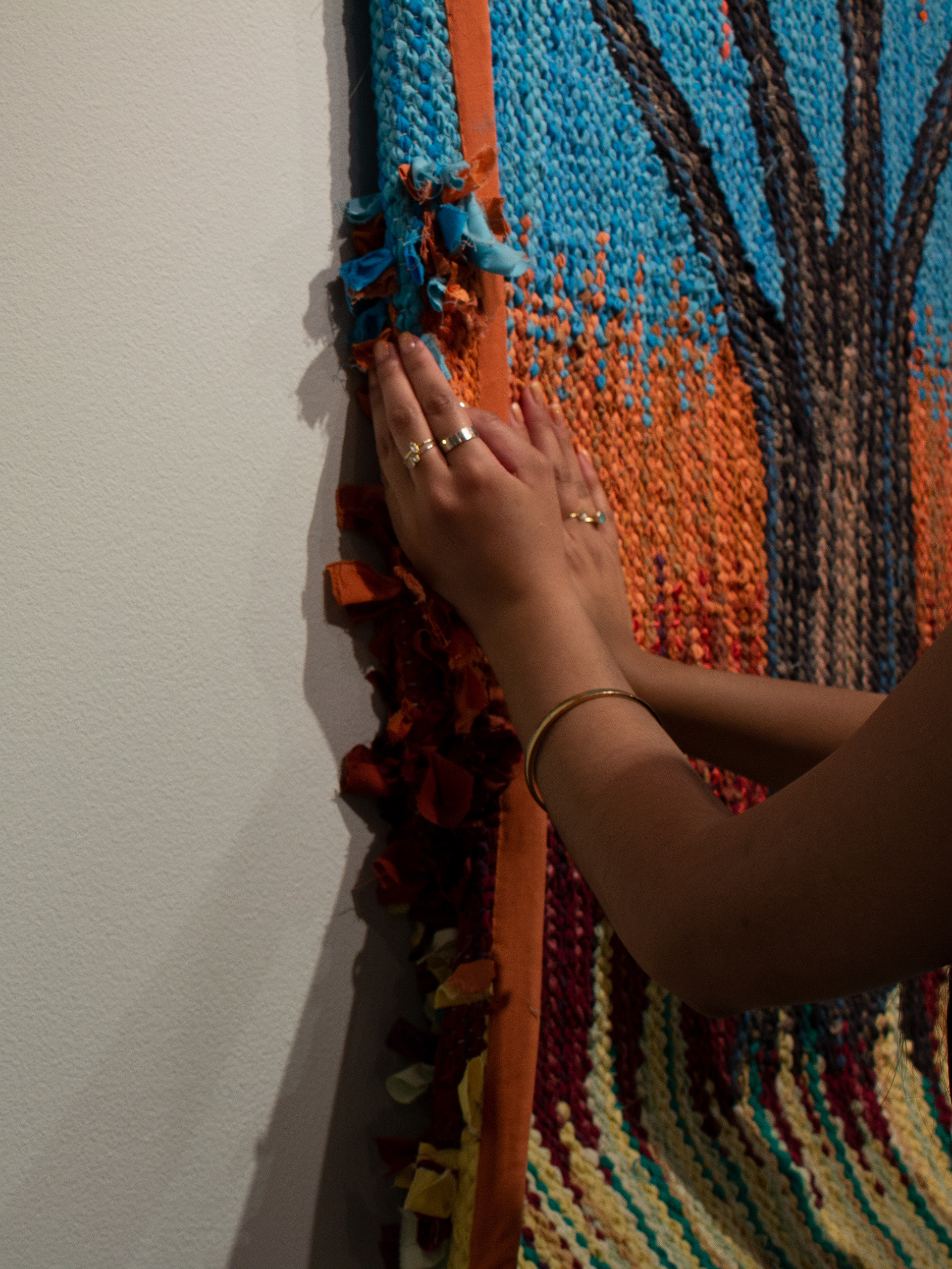
Final colorway for the map. Swatches were developed with CMYK specifications to send to the tactile printing company.
The numerous amounts of buildings also provided an information design challenge: Which buildings were worth labeling and which were not? As a team, we decided that community spaces and resources were the most important buildings to label.
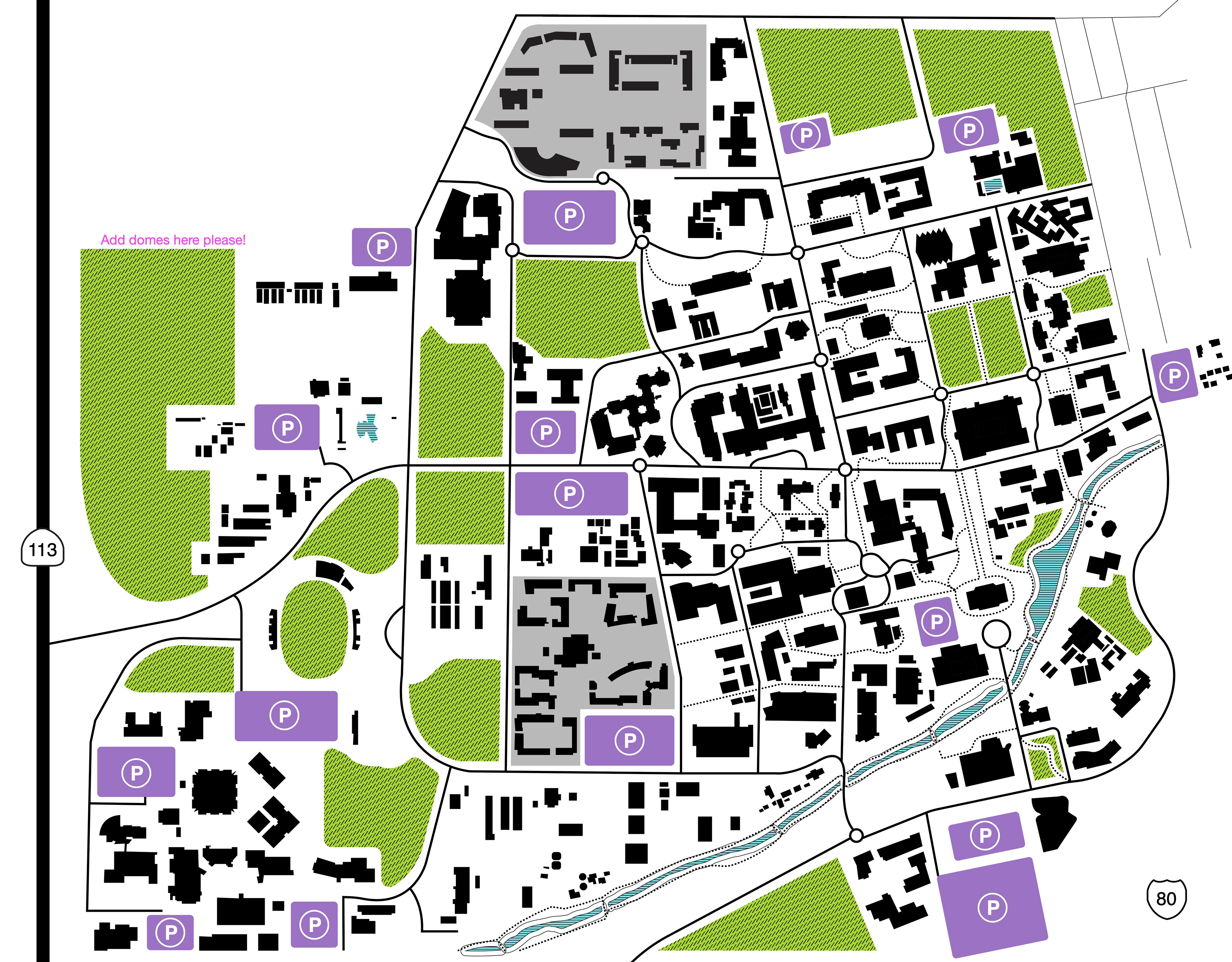
The final iteration of the map sent to the manufacturer.
The final iteration of the map sent to the manufacturer.